· Matthias Quinn · 6 min read
Bike Sharing
My first time series project
Quinn - Bike Sharing Project
Matthias Quinn 2017-08-22
My First Time-Series Project
This is my first time series project, about 7 years ago. Please keep in mind that it won’t be the best analysis you’ve ever seen.
The name of the data frame was originally called day for some reason, so I took the liberty of making some changes
setwd("C:\\Users\\miqui\\OneDrive\\R Projects\\Bike Sharing_Time Series")
library(forecast)
library(tseries)
library(ggplot2)
library(lubridate)
library(readr)
Import the main dataset:
df <- read.csv("day.csv", header = TRUE, stringsAsFactors = FALSE)
View(df)
Change the dates to a better format.
head(df)
| instant | dteday | season | yr | mnth | holiday | weekday | workingday | weathersit |
|---|---|---|---|---|---|---|---|---|
| 1 | 1 | 1/1/2011 | 1 | 0 | 1 | 0 | 6 | 0 |
| 2 | 2 | 1/2/2011 | 1 | 0 | 1 | 0 | 0 | 0 |
| 3 | 3 | 1/3/2011 | 1 | 0 | 1 | 0 | 1 | 1 |
| 4 | 4 | 1/4/2011 | 1 | 0 | 1 | 0 | 2 | 1 |
| 5 | 5 | 1/5/2011 | 1 | 0 | 1 | 0 | 3 | 1 |
| 6 | 6 | 1/6/2011 | 1 | 0 | 1 | 0 | 4 | 1 |
| temp | atemp | hum | windspeed | casual | registered | count | ||
| 1 | 0.344167 | 0.363625 | 0.805833 | 0.160446 | 331 | 654 | 985 | |
| 2 | 0.363478 | 0.353739 | 0.696087 | 0.248539 | 131 | 670 | 801 | |
| 3 | 0.196364 | 0.189405 | 0.437273 | 0.248309 | 120 | 1229 | 1349 | |
| 4 | 0.2 | 0.212122 | 0.590435 | 0.160296 | 108 | 1454 | 1562 | |
| 5 | 0.226957 | 0.22927 | 0.436957 | 0.1869 | 82 | 1518 | 1600 | |
| 6 | 0.204348 | 0.233209 | 0.518261 | 0.0895652 | 88 | 1518 | 1606 |
df$Date <- mdy(df$dteday)
A good starting point is to plot the series and visually examine it for any outliers, volatility, or irregularities.
ggplot(data = df, aes(x = Date, y = count)) +
       geom_line(col = "red") +
       scale_x_date("month") +
       ylab("Daily Bike Checkouts") +
       xlab("")
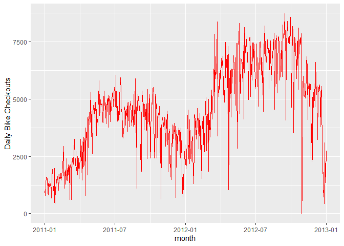
As you can see, the number of bikes has a rather large decrease during months. That’s probably why you don’t see bikers in December in the park.
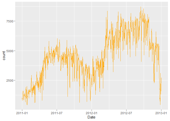
R provides a convenient method for removing time series outliers: tsclean(). It’s part of the ‘forecast’ package. It identifies and replaces outliers using series smoothing and decomposition. This method is also capable of imputing missing values in a time series.
- Create a Time-Series Object
names(df)
[1] “instant” “dteday” “season” “yr” “mnth”
[6] “holiday” “weekday” “workingday” “weathersit” “temp”
[11] “atemp” “hum” “windspeed” “casual” “registered” [16] “count” “Date”
count.ts <- ts(df[, c("count")])

df$count <- tsclean(count.ts) # Replace the original count

anyNA(count.ts) # Hooray!
[1] FALSE
rm(count.ts)
ggplot(data = df, aes(x = Date, y = count)) +
      geom_line(col = "orange")
- Moving Average
A data smoothing technique. The wider the window of the MA, the smoother the original series becomes. In our bicycle example, we can take weekly or monthly moving average, smoothing the series into something more stable and therefore more predictable.
df$count.MA <- ma(df$count, order = 7, centre = TRUE) #Go back and take the past 7 points and average them.
df$count.MA30 <- ma(df$count, order = 30, centre = TRUE)

ggplot(data = df) +
    geom_line(aes(x = Date, y = count, colour = "Counts")) +
    geom_line(aes(x = Date, y = count.MA, colour = "Weekly Moving Average")) +
    geom_line(aes(x = Date, y = count.MA30, colour = "Monthly Moving Average")) +
    ylab("Bicycle Count")
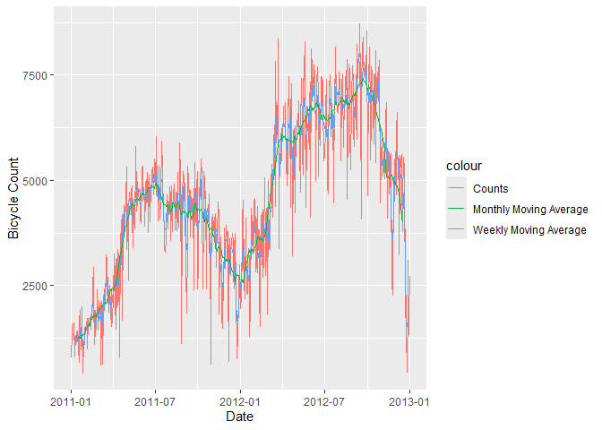
Now that is cool.
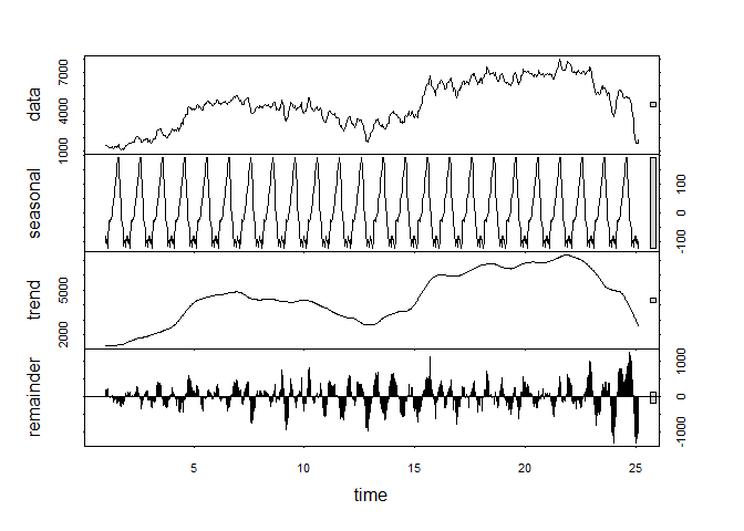
- Decompose Your Data
Decomposition:
The building blocks of a time series analysis are:
Seasonality:
- Fluctuations in the data related to calendar cycles
Trend:
- The overall pattern of the series
Cycle:
The increasing and/or decreasing patterns that are not seasonal
Usually grouped together
Error:
- Everything you can’t explain
Not every series will have all 3 of these components.
3.1 Calculate the Seasonal Component of the Series.
count.MA <- ts(na.omit(df$count.MA), frequency = 30) #30 obs. per month
decomp <- stl(count.MA, s.window = "periodic")
deseasonal.count <- seasadj(decomp)
plot(decomp)
- Stationarity
Fitting an ARIMA model requires the series to be STATIONARY.
A series is stationary when its Mean, Variance, and Autocovariance are time invariant.
The augmented Dickey-Fuller(ADF) test is a formal statistical test for stationarity.
The Null Hypothesis assumes that the series is NOT stationary.
ADF test whether the change in Y can be explained by lagged value and a linear trend.
Our bicycle data is non-stationary; the mean number of bike checkouts changes through time.
adf.test(count.MA, alternative = "stationary")
Warning in adf.test(count.MA, alternative = “stationary”): p-value greater than printed p-value
Augmented Dickey-Fuller Test
data: count.MA Dickey-Fuller = -0.2557, Lag order = 8, p-value = 0.99 alternative hypothesis: stationary
Dickey-Fuller = -0.2557, Lag order = 8
p-value = 0.99
Alternative Hypothesis = Stationary
We cannot reject the null hypothesis, so this is most likely a nonstationary series.
Autocorrelation plots (ACF) are a useful visual tool in determining whether a series is stationary. If the series is correlated with its lags, then -generally- there are some trend or seasonal components and therefore, its statistical properties are NOT constant over time.
ACF plots show correlation between a series and its lags.
Acf(count.MA, type = "correlation")
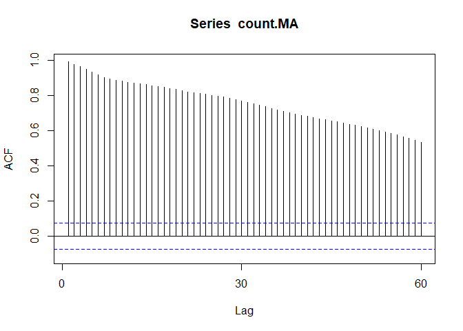
If you notice the little blue dots, those act as confidence intervals. Now, when your correlation crosses those blue lines, there is pretty strong evidence for autocorrelation.
Pacf(count.MA)
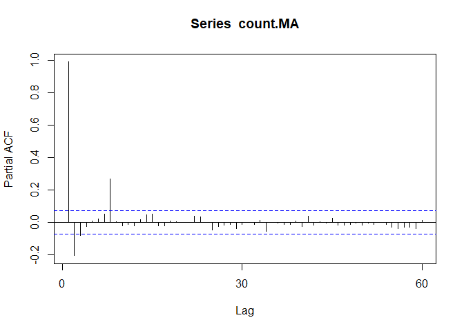
We can use differencing to correct this problem.
We’ll start with d=1 and re-evaluate whether more differencing is needed.
count.D1 <- diff(deseasonal.count, differences = 1)
plot(count.D1)
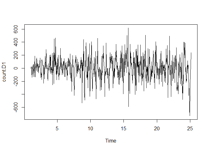
#That looks a lot more stationary
adf.test(count.D1, alternative = "stationary")
Warning in adf.test(count.D1, alternative = “stationary”): p-value smaller than printed p-value
Augmented Dickey-Fuller Test
data: count.D1 Dickey-Fuller = -9.9255, Lag order = 8, p-value = 0.01 alternative hypothesis: stationary
Augmented Dickey-Fuller Test:
Dickey-Fuller = -9.9255
Lag order = 8
p-value = 0.01
Alternative Hypothesis = Stationary
This suggests that diffferencing by 1 is sufficient.
Next, spikes @ particular lags of the differenced series can help inform the choice of P or Q for our model.
Acf(count.D1) #Looks like 7
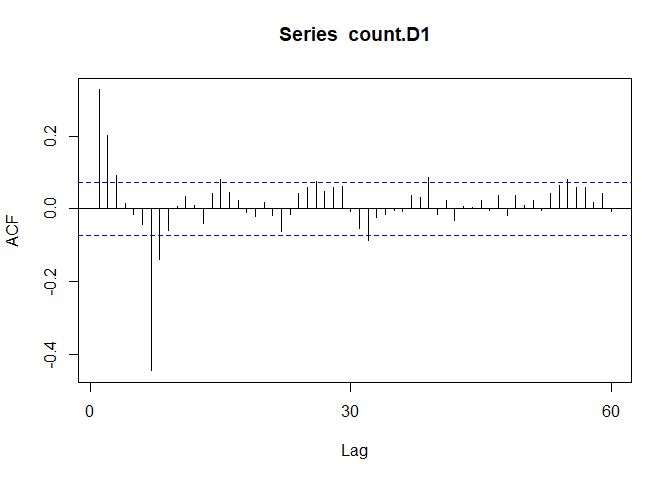
Pacf(count.D1) #7 as well
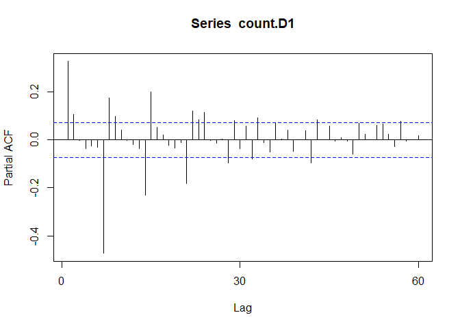
This suggests that we may want to try models with AR or MA components of order 1, 2, or 7.
A spike @ lag 7 might suggest that there is a seasonal pattern present, perhaps as the day of the week.
- Fitting an ARIMA Model.
The FORECAST package allows either tuning an ARIMA model yourself, or just generating an optimal (P,D,Q) using auto.arima(). auto.arima() searches through combinations of parameters and picks the best ones to optimize the fit criteria.
The 2 most widely use criteria are Akaike Information Criteria (AIC) and Bayesian Information Criteria (BIC).
AIC and BIC tell you how much information is lost if a model is chosen. The goal is to minimize AIC,BIC.
fit <- auto.arima(y = deseasonal.count, seasonal = FALSE)
fit
Series: deseasonal.count ARIMA(2,1,0)
Coefficients: ar1 ar2 0.2929 0.1055 s.e. 0.0370 0.0370
sigma^2 = 26137: log likelihood = -4708.32 AIC=9422.64 AICc=9422.68 BIC=9436.4
ARIMA (1,1,1) Coefficients:
ar1 ma1 0.5510 -0.2496
s.e. 0.0751 0.0849
Sigma^2 estimated as 26,180
Log-likelihood = 4708.91
AIC = 9423.82
AICc = 9423.85
BIC = 9437.57
The fitted model is Y-hat(dt) = 0.551Y(t-1) - 0.2496Y(t-1) + Error
AR(1) of 0.551 tells you that the next value in the series is taken as a dampened previous value by a factor of 0.551 and depends on the previous error lag.
- Evaluate and Iterate
Now that we have fitted a model, does it make sense?
We can start with residual plots and examine ACF and PACF plots. If the model parameters and structure are correctly specified, we would expect no significant autocorrelations present.
tsdisplay(fit$residuals, lag.max = 45, main = "(1,1,1) Model Residuals")
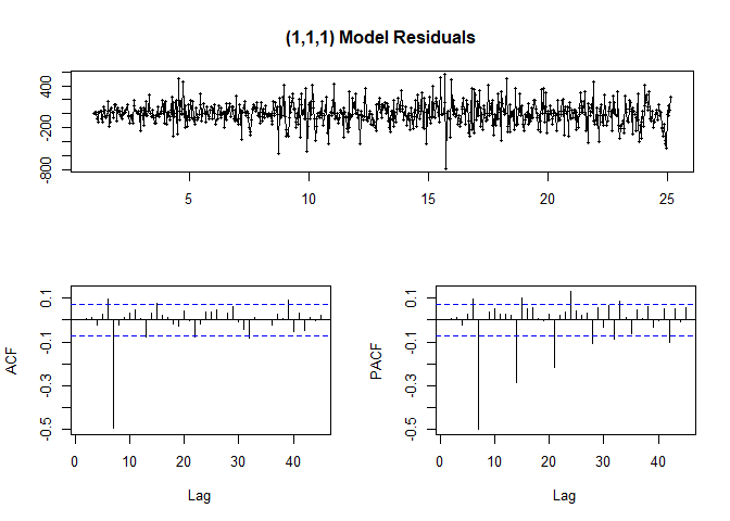
Looking at ACF/PACF and the residuals, our model may be better off with a different parameter value such as P=7 or Q=7.
So it looks like the highest point in the ACF and PACF plots tell us what the best parameters are.
2nd Model
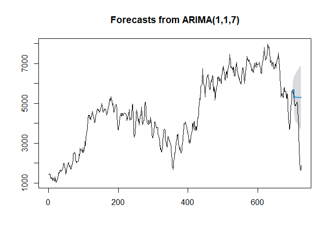
fit2 <- arima(deseasonal.count, order = c(1,1,7))

fit2
Call: arima(x = deseasonal.count, order = c(1, 1, 7))
Coefficients: ar1 ma1 ma2 ma3 ma4 ma5 ma6 ma7 0.2803 0.1465 0.1524 0.1263 0.1225 0.1291 0.1471 -0.8353 s.e. 0.0478 0.0289 0.0266 0.0261 0.0263 0.0257 0.0265 0.0285
sigma^2 estimated as 14392: log likelihood = -4503.28, aic = 9024.56
Now we have 7 coefficients
tsdisplay(fit2$residuals, lag.max = 15, main = "Seasonal Model Residuals",
          col = "blue")
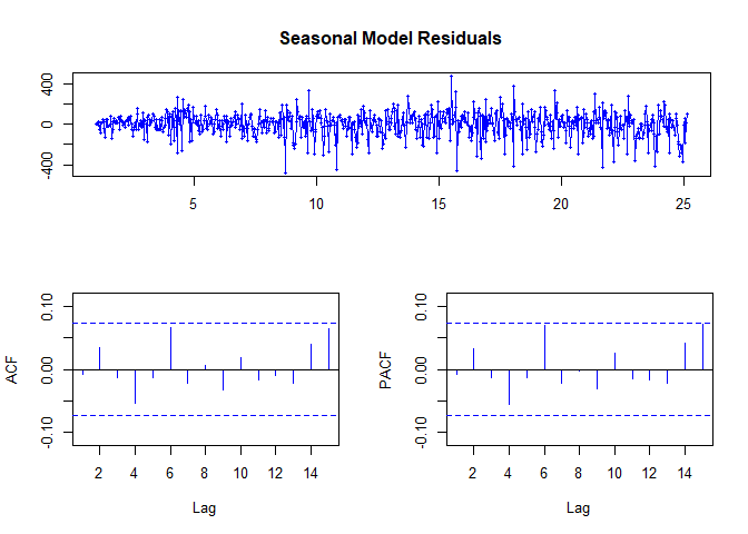
#HOORAY!
The ACF and PACF are within our bounds!
- Predict
h = the number of periods to forecast
Fcast <- forecast(fit2, h = 30, level = 95) #Predict 30 periods ahead
Fcast
| Point | Forecast | Lo95 | Hi95 |
|---|---|---|---|
| 25.17 | 2092.613 | 1857.1479 | 2328.078 |
| 25.20 | 2456.853 | 2046.7214 | 2866.984 |
| 25.23 | 2564.91 | 1992.5593 | 3137.261 |
| 25.27 | 2529.535 | 1803.3075 | 3255.762 |
| 25.30 | 2688.347 | 1812.4941 | 3564.2 |
| 25.33 | 2737.422 | 1712.9652 | 3761.88 |
| 25.37 | 2671.267 | 1495.2428 | 3847.291 |
| 25.40 | 2652.721 | 1412.3491 | 3893.093 |
| 25.43 | 2647.522 | 1360.6078 | 3934.436 |
| 25.47 | 2646.064 | 1317.8683 | 3974.26 |
| 25.50 | 2645.656 | 1278.3863 | 4012.925 |
| 25.53 | 2645.541 | 1240.5453 | 4050.537 |
| 25.57 | 2645.509 | 1203.8448 | 4087.173 |
| 25.60 | 2645.5 | 1168.0966 | 4122.903 |
| 25.63 | 2645.497 | 1133.2045 | 4157.79 |
| 25.67 | 2645.497 | 1099.1028 | 4191.891 |
| 25.70 | 2645.496 | 1065.7378 | 4225.255 |
| 25.73 | 2645.496 | 1033.0634 | 4257.929 |
| 25.77 | 2645.496 | 1001.0381 | 4289.955 |
| 25.80 | 2645.496 | 969.6247 | 4321.368 |
| 25.83 | 2645.496 | 938.7895 | 4352.203 |
| 25.87 | 2645.496 | 908.5015 | 4382.491 |
| 25.90 | 2645.496 | 878.7327 | 4412.26 |
| 25.93 | 2645.496 | 849.4572 | 4441.536 |
| 25.97 | 2645.496 | 820.6513 | 4470.342 |
| 26.00 | 2645.496 | 792.2931 | 4498.7 |
| 26.03 | 2645.496 | 764.3624 | 4526.63 |
| 26.07 | 2645.496 | 736.8404 | 4554.152 |
| 26.10 | 2645.496 | 709.7096 | 4581.283 |
| 26.13 | 2645.496 | 682.9538 | 4608.039 |
#Cool.
plot(Fcast)
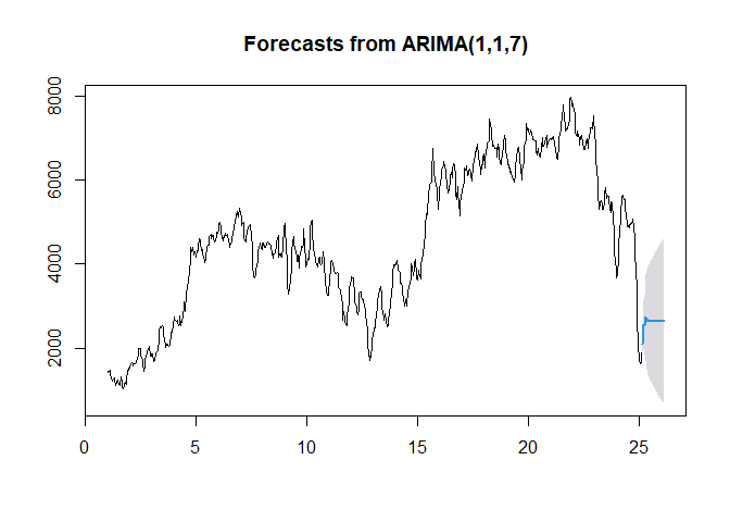
The light-blue line above shows the fit provided by the model. But just how well did our model do?
Just like ML, we’ll’ use training and testing sets.
hold <- window(ts(deseasonal.count), start = 700)

fit.no.holdout <- arima(ts(deseasonal.count[-c(700:725)]),
                        order = c(1,1,7))
Fcast.no.holdout <- forecast(fit.no.holdout, h = 25, level = 95)

plot(Fcast.no.holdout)
lines(ts(deseasonal.count))
Notice how the Blue line is kind of just linear and flat.
How does that make Sense?
That’s’ all for now, I guess…